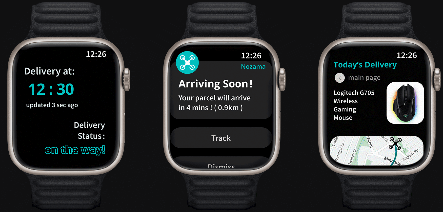
Designed for instant updates, quick actions, and seamless last-mile tracking on the wrist.
Goal
To improve the delivery experience through real-time tracking, context-aware alerts, and hands-free access to essential delivery information—all designed for the limitations and opportunities of smartwatch interfaces.
My Role
Smartwatch UI UX Design
Duration
13 weeks
Platform
IOS Smartwatch Interface
Overview
This smartwatch solution enhances the drone delivery experience by providing real-time delivery status updates, smart alerts, and context-aware interactions directly on users’ wrists.
As part of a collaborative multi-device initiative, each team member focused on a distinct platform—desktop, mobile, and smartwatch—targeting different user scenarios. My role focused on designing the smartwatch experience, optimising for quick glances and minimal interaction.
The goal was to reduce delivery uncertainty while supporting hands-free, on-the-go awareness.
Problem statement
What is going on?
Traditional delivery tracking interfaces often rely on mobile or desktop platforms that demand frequent attention and manual checking. However, users may not always have the time or availability to monitor these updates—especially during busy or multitasking moments.
We saw an opportunity to create a more accessible and passive tracking experience by leveraging the smartwatch’s form factor, focusing on glanceable information, timely alerts, and seamless interaction.
How might we
create a seamless smartwatch interface that:
1.
Keeps users updated on delivery progress in real-time.
2.
Doesn't disrupt their day or require manual tracking.
Smartwatch design solution
We translated key delivery interactions into a smartwatch-friendly experience—making it easier for users to stay informed, take action, and manage expectations in real time. The design focuses on minimising cognitive effort while maximising timely task awareness.

Design process
From User Flow to Wrist-Ready Interaction
The smartwatch design required rethinking the delivery journey through the lens of minimal screen space, lightweight interaction, and contextual relevance. Our process focused on mapping essential touchpoints and reducing friction for users needing quick information access.

1. Discover & Define
• User journey mapping to uncover interaction bottlenecks
• Online ethnography and review analysis
• Affinity diagramming to synthesise user needs
2. Ideate & Explore
• Sketching layout hierarchies and notification logic
• Creating low-fidelity wireframes to explore interaction flows
• Iterating layout clarity, touch accessibility, and feedback systems

3. Prototype & Test
• A glanceable UI system with icon-based cues
• Colour-coded feedback for delivery status
• Streamlined flows for redirection and confirmation
Research approach
User Research & Insight Generation
To design a delivery experience that truly meets user expectations, we conducted a layered research process combining background exploration, online ethnography, and affinity diagramming. This allowed us to uncover behavioural patterns, frustrations, and unmet needs that shaped our design strategy
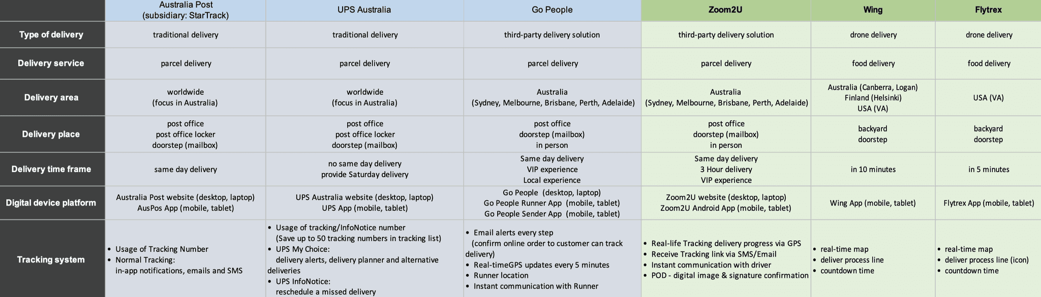
Understanding the Delivery Ecosystem
To build a more user-centric delivery experience, we began by analysing three dominant last-mile delivery models: traditional courier services, third-party logistics, and drone delivery.
Four key factors – shape user satisfaction
• Speed and timing accuracy
• Convenience of parcel collection
• Tracking visibility
• Security and reliability of drop-off
Exploring Real-World User Sentiment
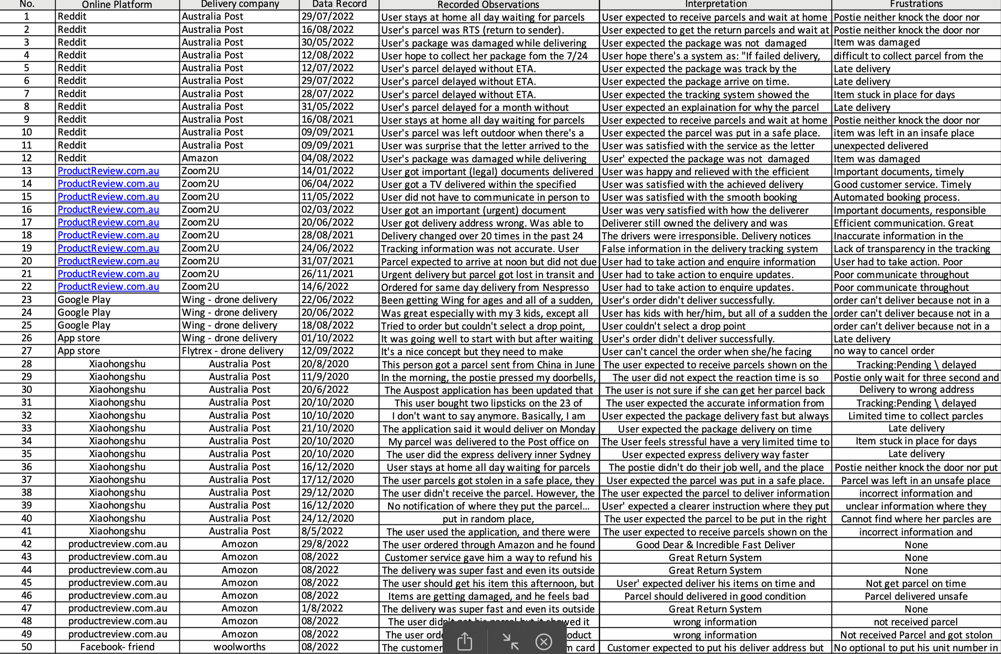
To contextualise these factors, we conducted an online ethnographic study to uncover delivery frustrations shared by users. Feedback was gathered from platforms including Reddit, Facebook, Xiaohongshu, ProductReview.com.au, and Trustpilot.
Key issues identified from this review included:
• Missed or delayed deliveries with little to no warning
• Confusing or inaccurate tracking updates
• Inflexible rescheduling options
• Limited customer service resolution
Synthesising Feedback into Key Themes
To make sense of the qualitative data, we conducted an affinity diagramming exercise to categorise and visualise common user pain points and expectations. This process enabled us to identify recurring patterns across various feedback sources and prioritise design opportunities.
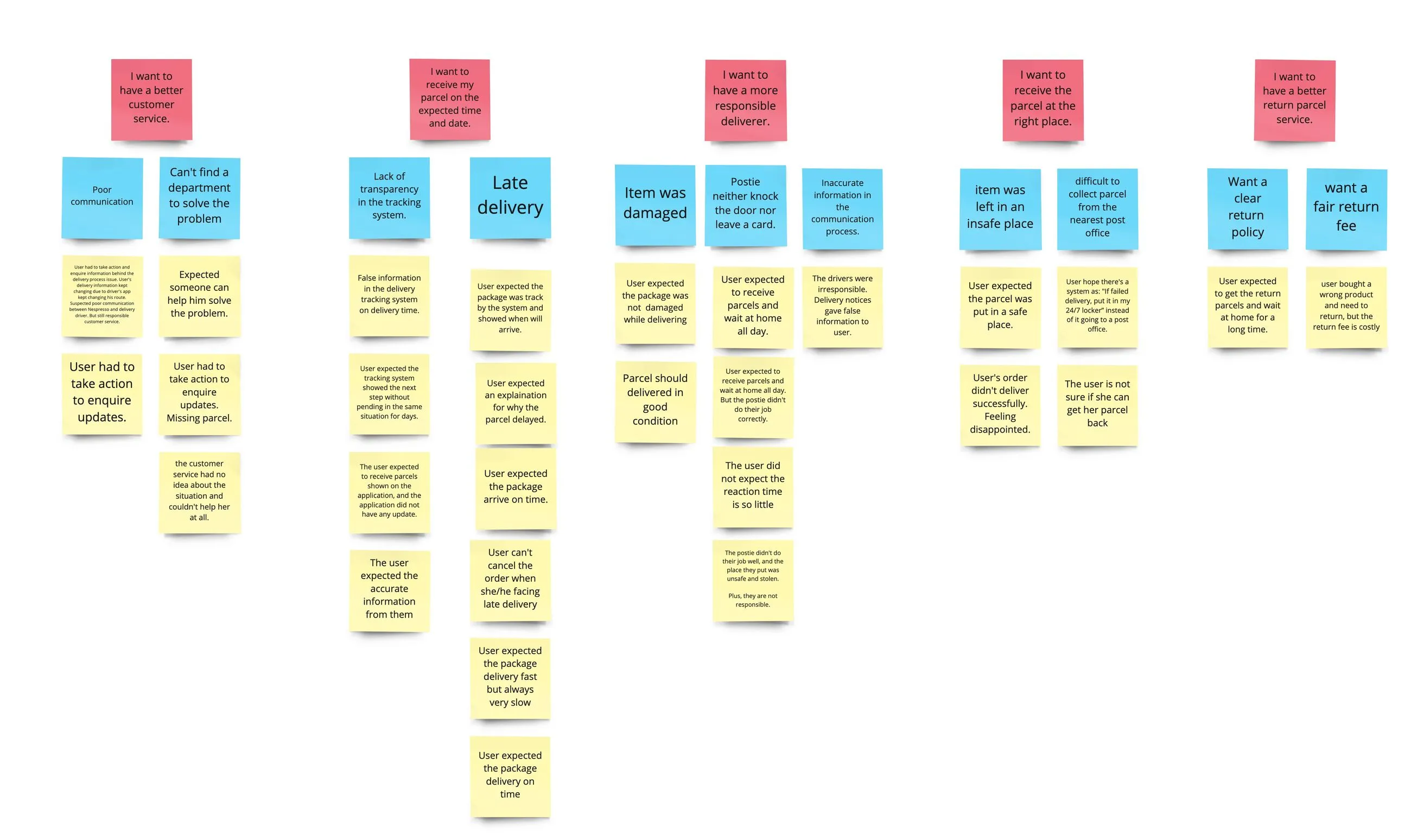
- Affinity diagram (click to see full image)
Key themes included:
• Uncertainty around delivery timing and status updates
• Inconvenience in rescheduling or redirecting deliveries
• Lack of transparency in the tracking system
• Concerns over parcel safety and delivery locations
• Frustration with inconsistent customer service
Translating Findings into Actionable Design Principles
Our research and synthesis led to five key insights that directly shaped our design strategy:

Clarity on Delivery Dates & Times
Improve delivery visibility and minimise uncertainty.
Defined Delivery Locations
Allow flexible and precise delivery options.
Flexible Return Policies
Reduce friction in post-purchase workflows.
Responsible Delivery Personnel
Build user trust through reliable handling.
Enhanced Customer Support
Provide clear escalation paths and faster resolution.
User journey map
Streamlining the Delivery Journey from Wrist
We mapped out the end-to-end delivery journey, tailored specifically to smartwatch interactions — highlighting key decision points and reducing cognitive effort
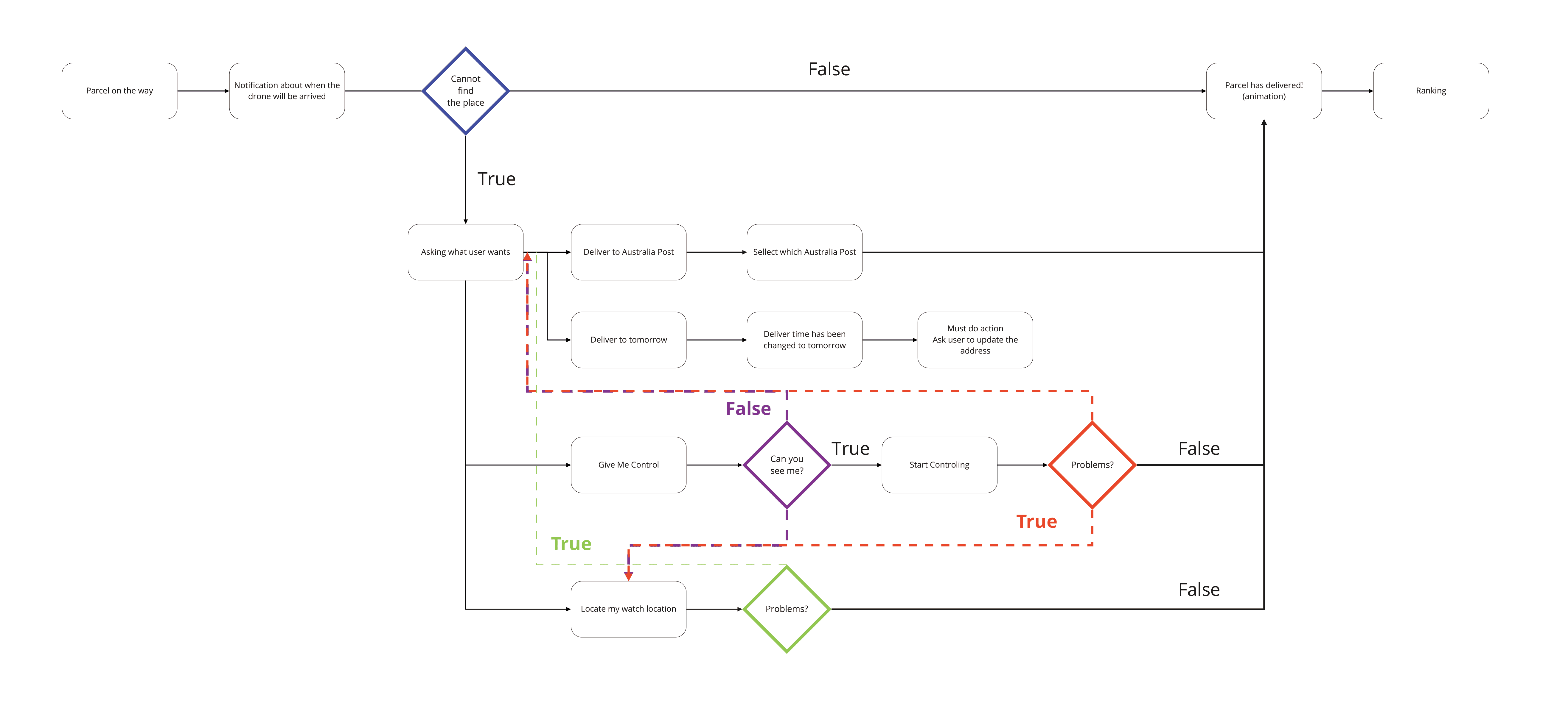
Core delivery steps and alternate pathways in smartwatch
Turning Complexity into Simplicity at a Glance
From our research, we identified several delivery pain points — ranging from tracking visibility gaps to last-minute delivery disruptions. Designing for a smartwatch further amplified the challenge: limited screen space, minimal user input, and the need for real-time clarity.
To address these constraints, we focused on:
Reducing cognitive load by surfacing only critical information
Proactive prompts to help users act before problems arise
Flexible fallback actions for location, timing, and delivery rerouting
Context-aware interaction flow that works passively until user input is required
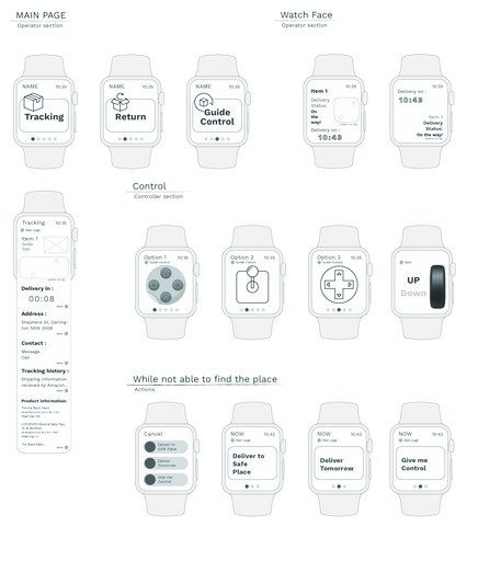
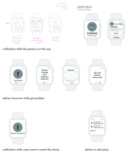
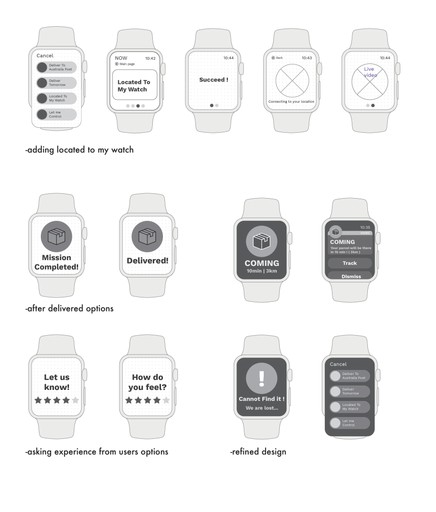
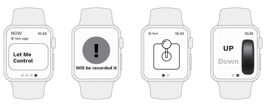
Wireframe design iteration process
Refining Wrist-First Interactions
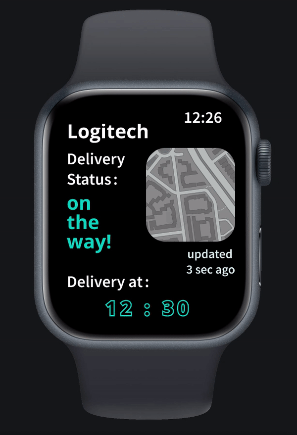
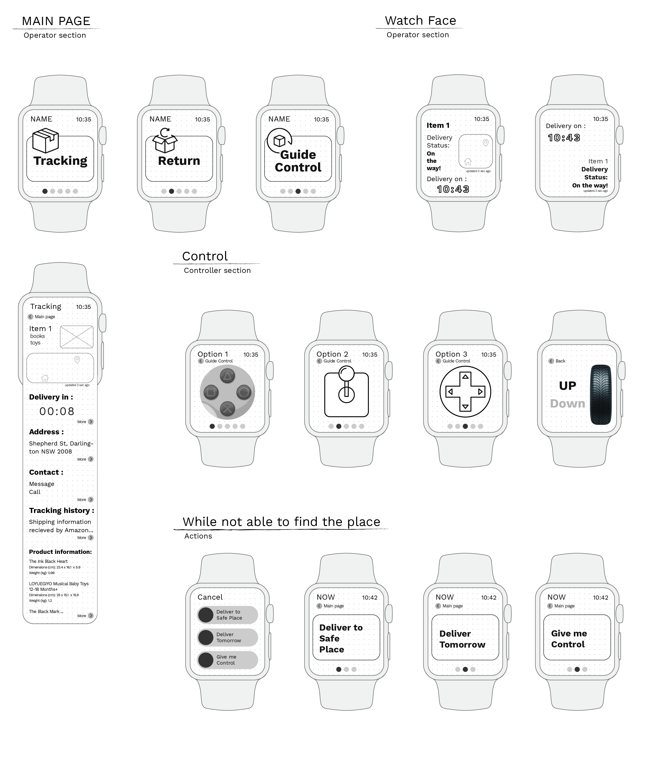
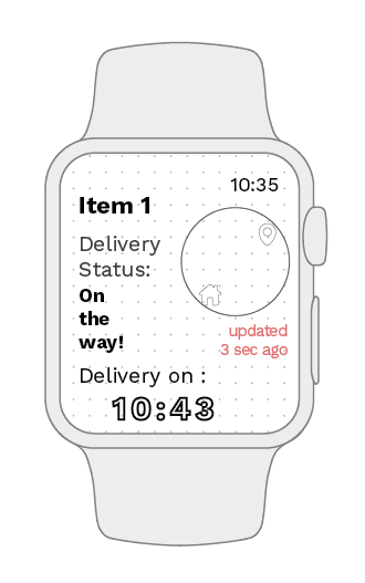
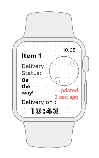
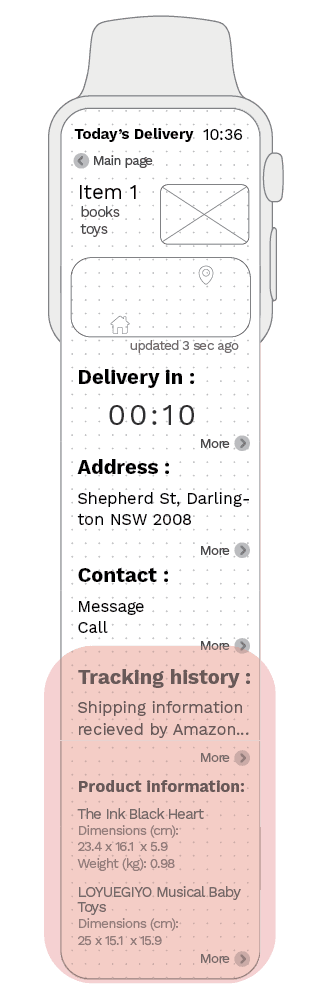
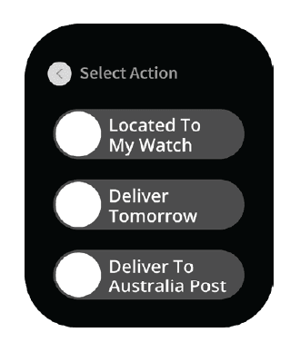
I structured the smartwatch interface through multiple low-fidelity iterations, gradually refining content structure, fallback scenarios, and visual clarity across five key screens: Main Page, Watch Face, Drone Control, Fallback Action Flow, and Arrival Notifications.
Heuristic evaluation refinements
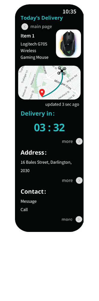
Translating Usability Insights into Interface Decisions
I applied heuristic evaluation principles to refine the smartwatch delivery flow. Each adjustment aimed to improve visual clarity, minimise cognitive load, and support real-time decision-making on a small screen. Below are key UI enhancements with rationale-driven comparisons.
Current interface flows
Navigating Key Delivery Scenarios
To demonstrate how the refined smartwatch interface supports key delivery scenarios, I mapped two representative interaction flows. These flows showcase how users receive parcel updates, respond to delivery issues, and complete feedback with minimal effort. Colour-coded arrows help visualise different navigation paths (forward, backward, two-directional, tap interaction).
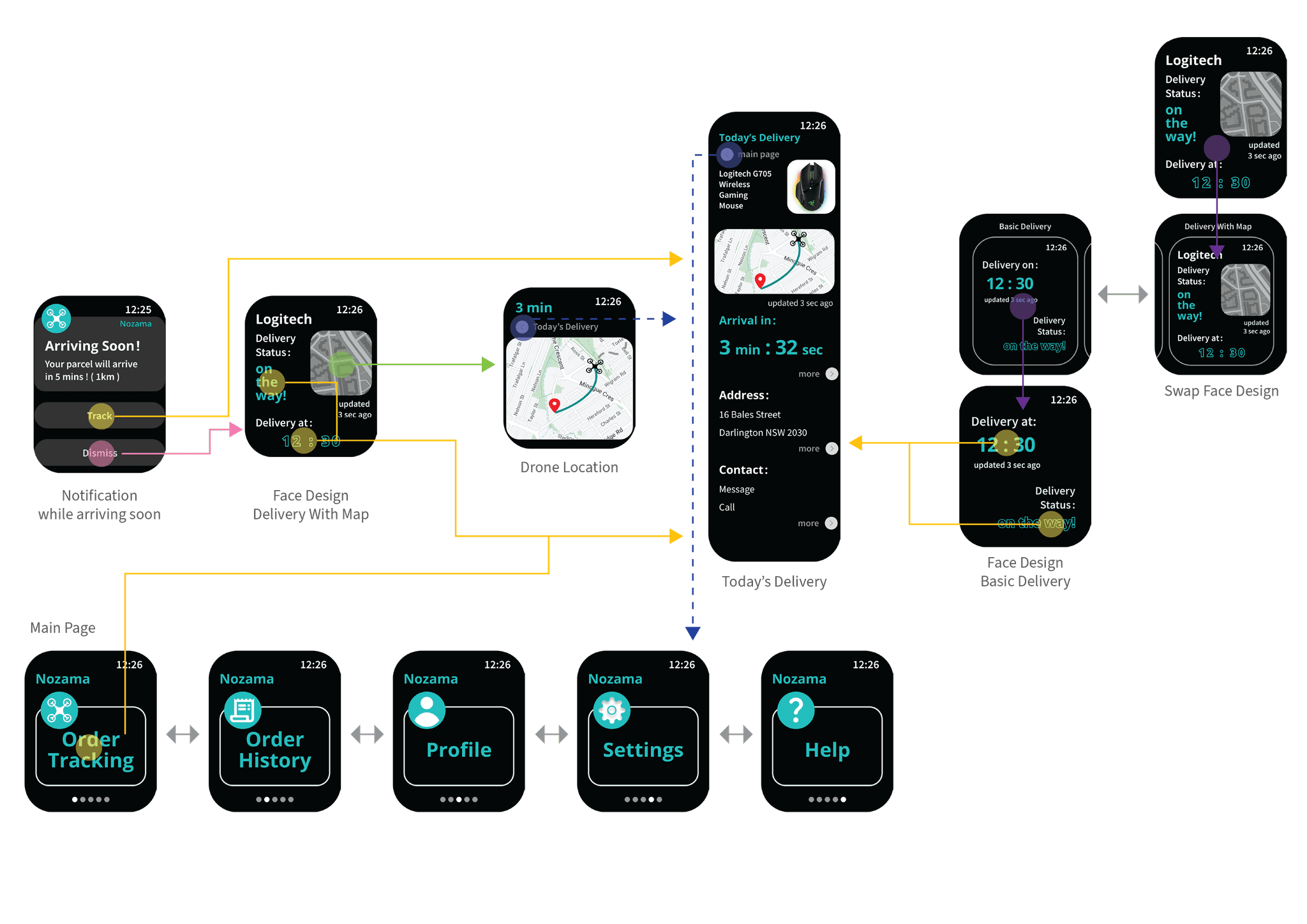
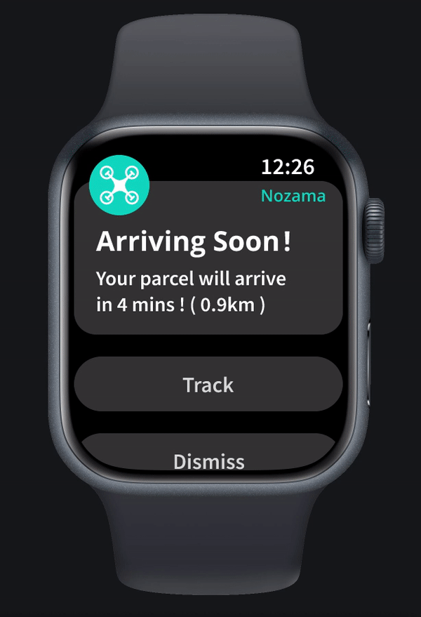
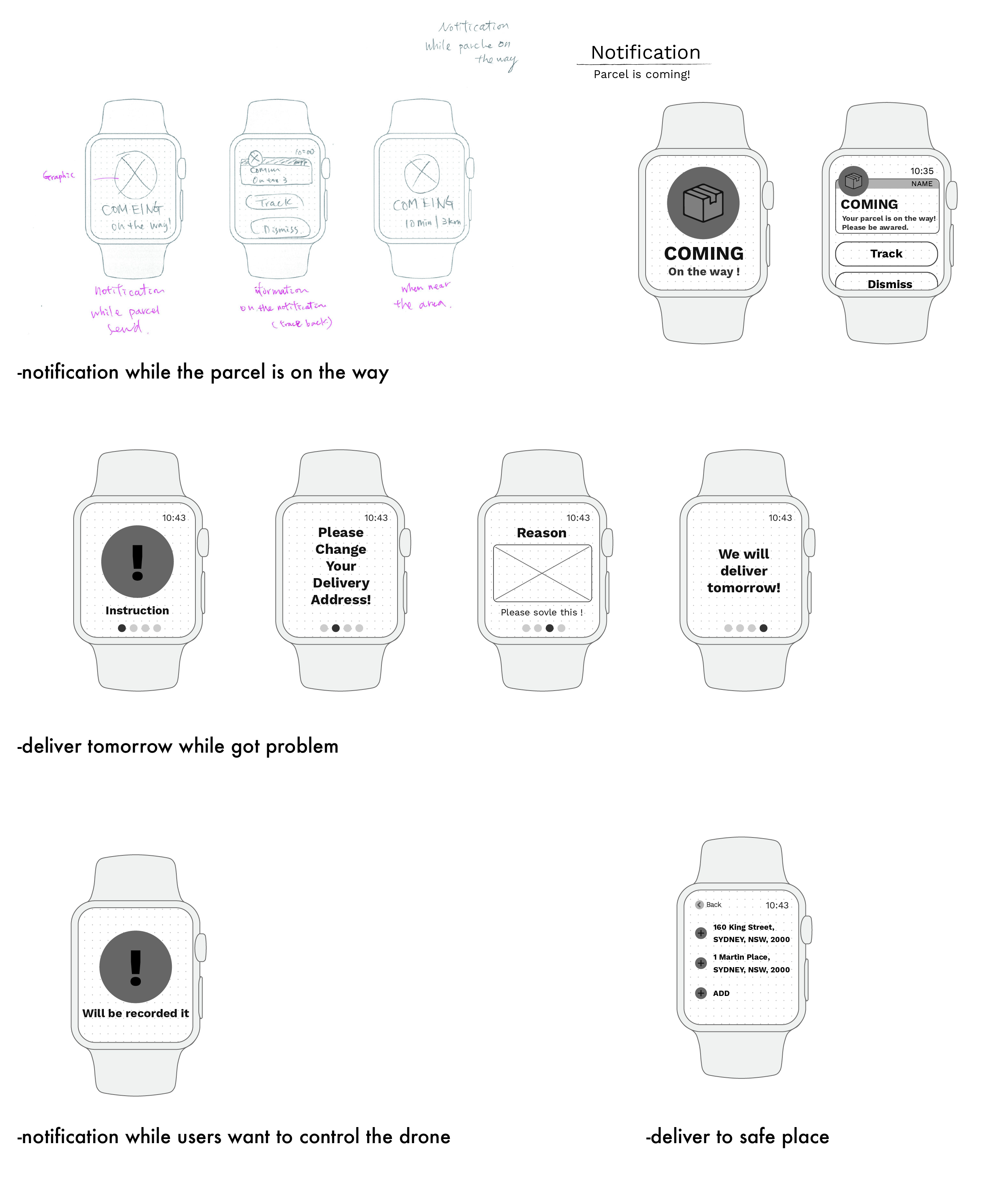
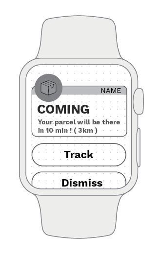
Scenario A — Drone Approaching & Notification Flow
When the parcel is approaching, the user receives a notification and can view the drone location and estimated arrival time.
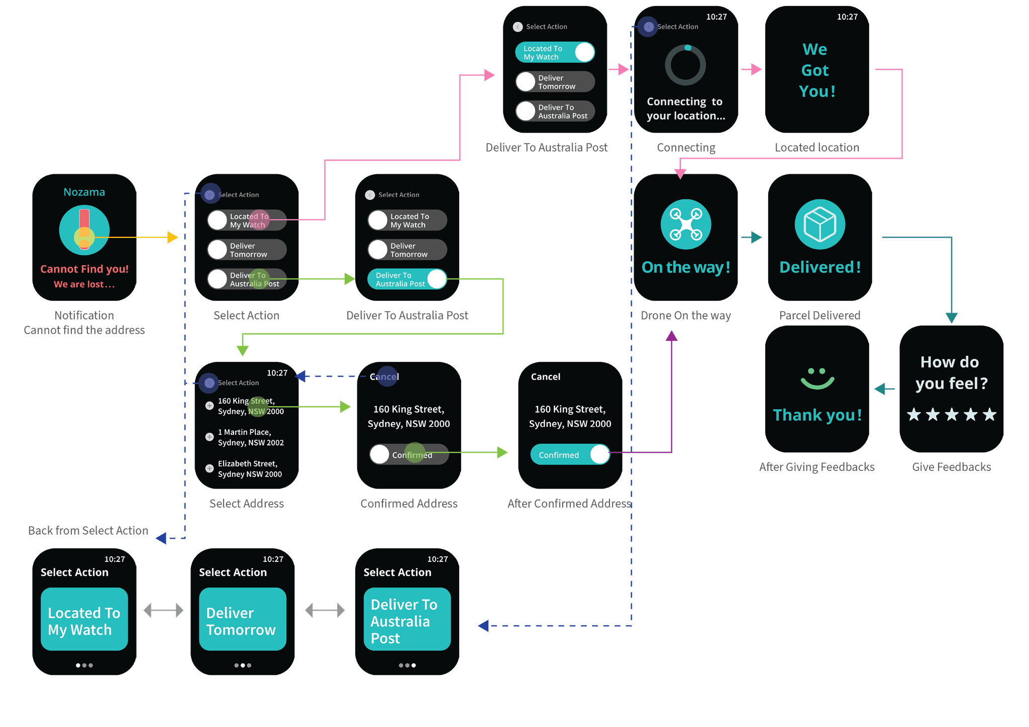
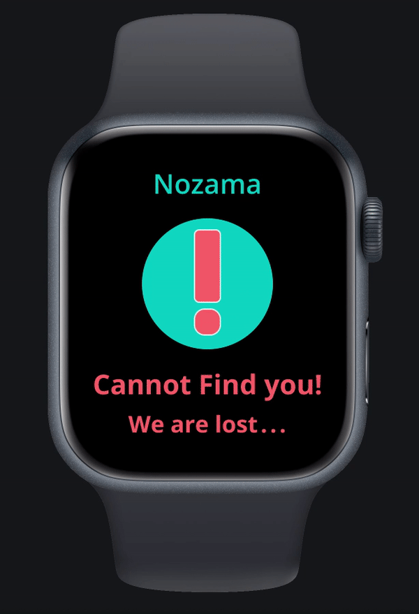
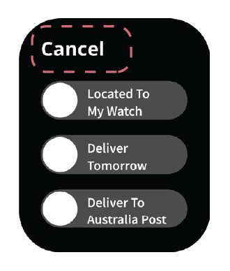
Scenario B — Resolving Delivery Issues & Feedback Flow
When the drone cannot find the user's location, the interface guides users to resolve it and complete the delivery process smoothly.
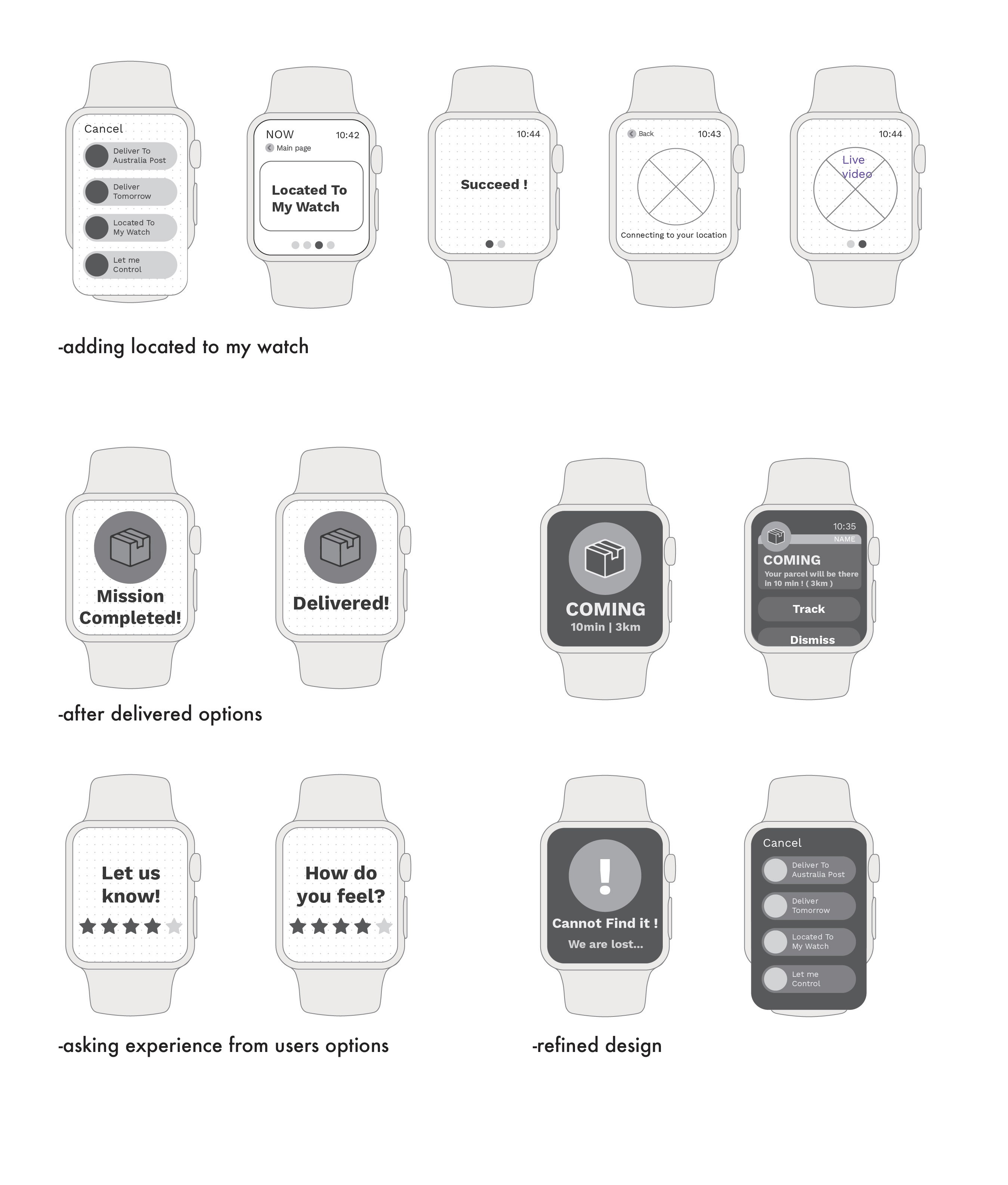
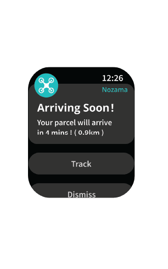
Prototype overview
Current Interface Preview & Interactive Prototype
To provide a closer look at the latest iteration of the smartwatch interface, I compiled a screen-based walkthrough showcasing key features, layout refinements, and task flows in context. This visual preview allows for a deeper understanding of how the interface performs across different use cases — from tracking delivery progress to responding to unexpected delivery issues.
Looking back and future
Reflecting on the Process
Designing for a smartwatch required a mindset shift, focusing on clarity, minimal interaction, and contextual cues. Each refinement was guided by user feedback and heuristic evaluation to ensure the interface remained intuitive even under time-sensitive or disrupted delivery scenarios.